
Always Discovering. Always Sharing.
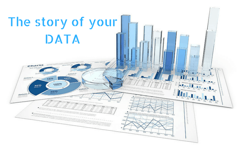
Data Visualization: Narrate the story of your data
In last few years many companies started looking into data they have been collecting. Found hidden truths and very many interesting things. But developers and designers are bit confused in how they should create dashboard or data rich applications. They forgot the basic principle that you are need to communicate to user and not just show them charts. You should design such that it tells a story in the data.
In last few years many companies started looking into data they have been collecting. Found hidden truths and very many interesting things. I’m lucky to get a chance to work on some of the very interesting, innovative and heavily data based solutions. Following are the thoughts I keep in mind while designing data rich applications.
1. Clear vision of data and relevant users
If you are dealing with a huge amount of data and designing a highly complex system. There might be chances that the same system will be used for a wide range of users. At the same time, these users might require looking at the same data but in a different manner as per their interest or requirements. In order to work your system efficiently, you must have the quality to extract actual information from the raw data as input. Just for an example in any organization, a manager requires data in numeric formats, analyst requires the same data as insight and marketing team needs the same data presented in some kind of charts.
The best data in this scenario is to make it qualitative or quantitative at first is always empirical. The empirical data can be any type of collected information that is gathered through experiments or observations. If the data is empirical then it will definitely answer specific questions. As when data is highly specific then taking a variety of actions on it becomes easier.
The data representation is an art of any developer. Generating information from raw data and present them for a variety of users is really a difficult work and require to stick to the point. Every next person requires data for their own way and purpose. One must have a clear vision of data, information, and requirements in order to end up with a robust, scalable and efficient system. Have a vision for what you are going to do with data. Use the same information to validate and navigate your vision. If possible then map the data into small informative pieces where you can begin to access data in a data-informed way. It will also help individuals to concentrate on the same point while discussing at once.
2. Consistency and Predictability of Interface
The data consistency is important! One of the most important quality aspects of designing data-driven interface is to make them throughout consistent. It allows users to become familiar with one section of an interface provided and also be able to use a different section of the interface just by the scheme created with the previous section. Simple, isn’t? This is how one design predictable interface; also learned behavior and play on existing mental models. In order to make data consistent, one need to first of all understand the broader context of your data and interface as well. You must have a clear view about how well our initial interface ideas can handle the scrutiny of a variety of raw data and information.
Just for an example a table in the database might not require being sorted or filtered in a single view, but what will happen when you need to present data along with another table in a different interface section? Can you be able to use the same interface you have just build if the new table requires being filtered and a legend or a key?
In the data-driven interface, consistency is all about allowing the design to retrospectively adopt that directly depends on your level of understanding of complexity. So it is good to start with lo-fi prototypes and then test your views and ideas with edge cases. There are chances that tables from database need to be sorted or filtered in many times, so design your interface with this in your mind. This might have cleared your view why the consistency of data is so important in data rich interface.
3. Reusable Patterns, States and Components
As discussed in previous section consistency is important. In order to achieve the consistency level, you need to build your interface in a smarter way. If you are not going to design a view for any individual then you can instead produce some set of designing rules which can be applied to any view of your interface. This approach will allow your viewers or other designers to easily implement new layout or pages in our interface with less complexity.
Patterns, States and Components:
A pattern is nothing but a small set of elements that compound together. In the interface, it could be a set of rating buttons, or a section of any toolbar, and are actually a proper way of organizing information that is connected with each other. As an example, a label and input types would also be a pattern within a form. Some group of patterns includes Left and right navigation, date range selector, sort dropdown and checkbox dropdown etc.
A component is a larger view of patterns and can also contain multiple patterns or even components as well. When we are dealing with highly data-driven sites then our aim is to provide a set of reusable and scalable components made up of reusable patterns. The above-mentioned patterns are from different products but are also consistent and this is why are predictable to users. The patterns together form a component.
Considering states, patterns may have a variety of visual looks depending on some set of circumstances. Maybe a chart or graph has no data in it, or a button in view is disabled, or there is an error. Every single thing needs to be considered.
4. Visualization and Shaping
The visualization of data is very important in data rich interface development. It must be presented in expected manner and should not be messed up with the design. The design component must be used properly such as line charts, pie graph, bar graph and area chart etc. In order to visualize your data, you must go through your raw data again and again. It will help you to understand your data properly, used variables, presentation approach, and relation to different data. If you found yourself in trouble about your data representation then you can use some tools such as Charted, Tableau, Google Sheets, Sketch, and Illustrator as well. These tools will help you to visualize your data and let it display as an interface. The proper visualization will take a huge amount of time and it's worth it. Do not worry about that, just try to start declaring variables and figure out the relation between your raw data.
In order to provide shape to your data, just follow some basic rules. You should understand to display important data that any user want to see first and then populate the remaining data based on user or data hierarchy. Once you are clear with data visualization then you will easily know how to provide shape to this data. It must be clear, compact, useful and informative to users. The very simple rule for design UX is shaped the information on the design so that viewer will have key information at a glance and then start providing supportive contents to them.
5. Basic and custom visualization
Another important aspect is making a decision to choose from basic or custom designs for your interface design. As you are dealing with data-driven technology then you must regularly consider any of these design approaches for your system, being a designer. The interface will be going to help the user to understand information from a raw data. The interface design must be unique and informative to users. A custom design, in this case, might help you a lot in order to deliver more information from your input data. A wide range of charts and graphs one can implement for any particular data as design. A basic design will only display the meaning of the data but a custom design will help individuals to get even more information from the same input data.
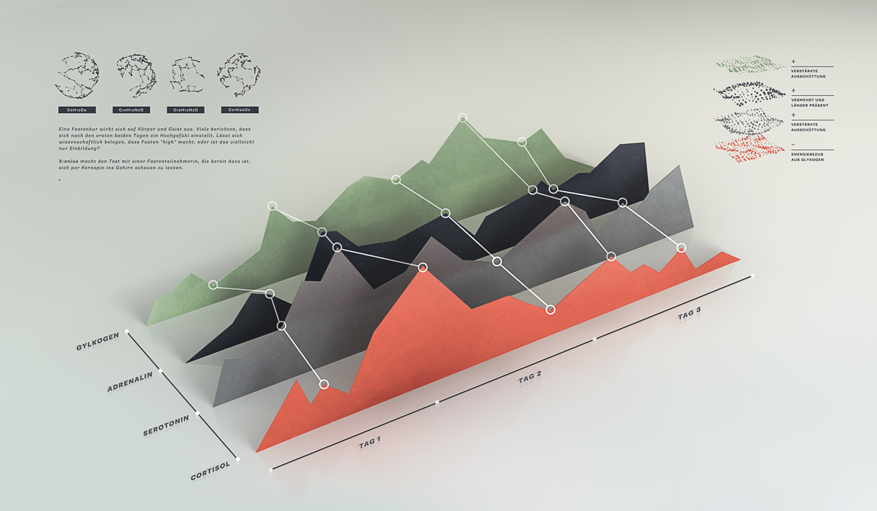
No doubt, a custom design, and visualization is a more complex job than basic visualization. One should ready to switch between any of these based on the client requirements. If you are a professional designer then you can also consider 3D design implementation for our data interface. It will populate even more information and a clear view to your users. They can easily differentiate and compare data just from such 3D views. Such visualizations might include simple graphs, graphs with peaks at the top, 3D graphs, 3D graphs with rotations and charts or graphs with relative data etc. Any of this idea can be used to give even a better insight of data. The custom visualization generally provides efficient data view, improves usability, distinct and compelling as well.
Conclusion
So far we have provided you so much information regarding handling the design part for data-driven technique. The interface is very important to display key information to your viewers without any complexity. The design must attract to your clients and also help them to complete their tasks without any a headache. It must be clear, informative and readable. The user will only understand the interface part of your data so it is your responsibility to provide them something that is very helpful. Once you are ready with your basic design development then you should keep looking for the area that can be optimized for a better representation.
We'd love to hear your idea thoughts on visualization, if you need help with your next visualization project then contact us at contact@veloxcore.com or call us.
Like reading this article, you can get notification when new article come up. So ahead and subscribe to our newsletter (we hate spam too).